
Case Study
Mobile News
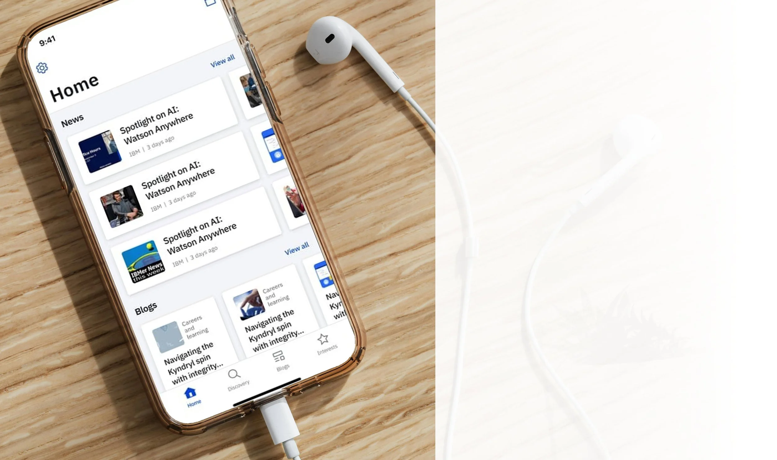
W3 is a native application designed to proactively equip IBM employees with essential information, enhancing job effectiveness and promoting informed company representation. As no comparable application existed within IBM's internal ecosystem, delivering user value through a familiar, modern, and innovative interface was paramount.
NDA in place
-
IBM lacked a unified mobile application for on-the-go employee access to diverse company information. Mandated by the CEO, this critical software aimed to significantly enhance the daily productivity of thousands of IBM employees.
-
Objective
Develop and launch a mobile application to keep internal employees informed about key company topics like Analytics, Blockchain, and Cloud, while integrating Agile and Design Thinking methodologies for continuous improvement.
Key Results
Design and launch a mobile app that aggregates content from internal websites, blogs, and company news channels.
Implement personalized content recommendations based on employee engagement and app usage patterns.
Introduce features that highlight trending content to keep employees informed on key topics making an impact within the organization.
Utilize Agile and Design Thinking methodologies to iterate and improve the app’s functionality, ensuring it meets user needs.
Achieve active usage of the app by employees across multiple departments, ensuring it becomes a primary tool for internal communication and content discovery.
16 NPS (Net Promoter Score)
77% Users very satisfied with the Calendar integration
-
Despite the absence of an existing mobile application or design system, most elements, including specific iconography and graphics, were developed from scratch. A notable challenge, and one we advocated for, was the dynamic implementation of IBM Plex, the official IBM font, into a native application to align with mobile device preferences.
-
My Role:
Lead UX/Visual DesignerMy Team:
Jr. UX Designer
Jr. Visual Designer
Senior User Researcher
Business Analyst
-
All IBM employees (350,000+)
User Age: 22 and up
-
Figma
Photoshop/Illustrator
Jira
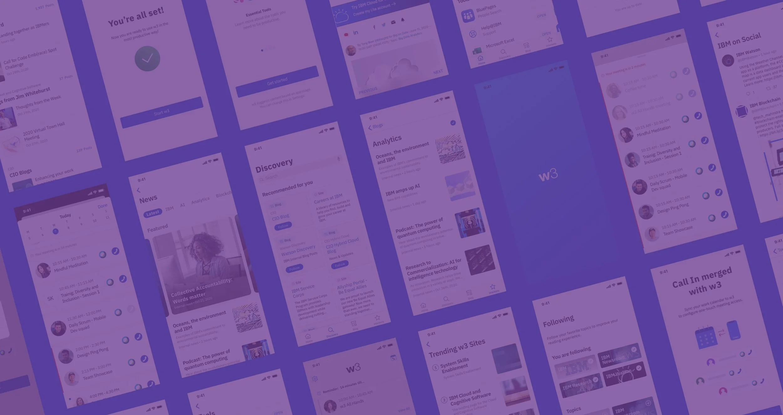
Certain specifics of this project are protected by non-disclosure agreements. This case study will focus on the aspects that were most widely utilized and appreciated by our users. Throughout the case study, examples of the completed design will be presented.
! NOTE !
This case study is concise and visually driven.
For a full methodological breakdown,
the Enterprise Quoting Study offers the extended, director's cut.
The method…
Design Thinking of course.

Kick off
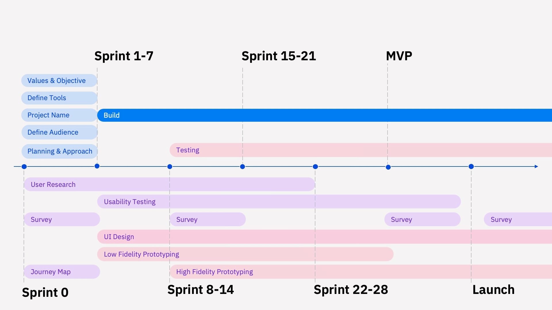
Design was not always our management’s first thought. However, with w3, I was involved in every stage of the design process, including timelines, competitive evaluation and preliminary research to understand our target users and to help create the initial personas.
Project Roadmap
Empathize
A discovery workshop with the team and the stakeholders to define current pain points and align on a shared vision. Then we created a competitive analysis, created personas, a rough user journey map, and defined action items and outcomes.
Discovery
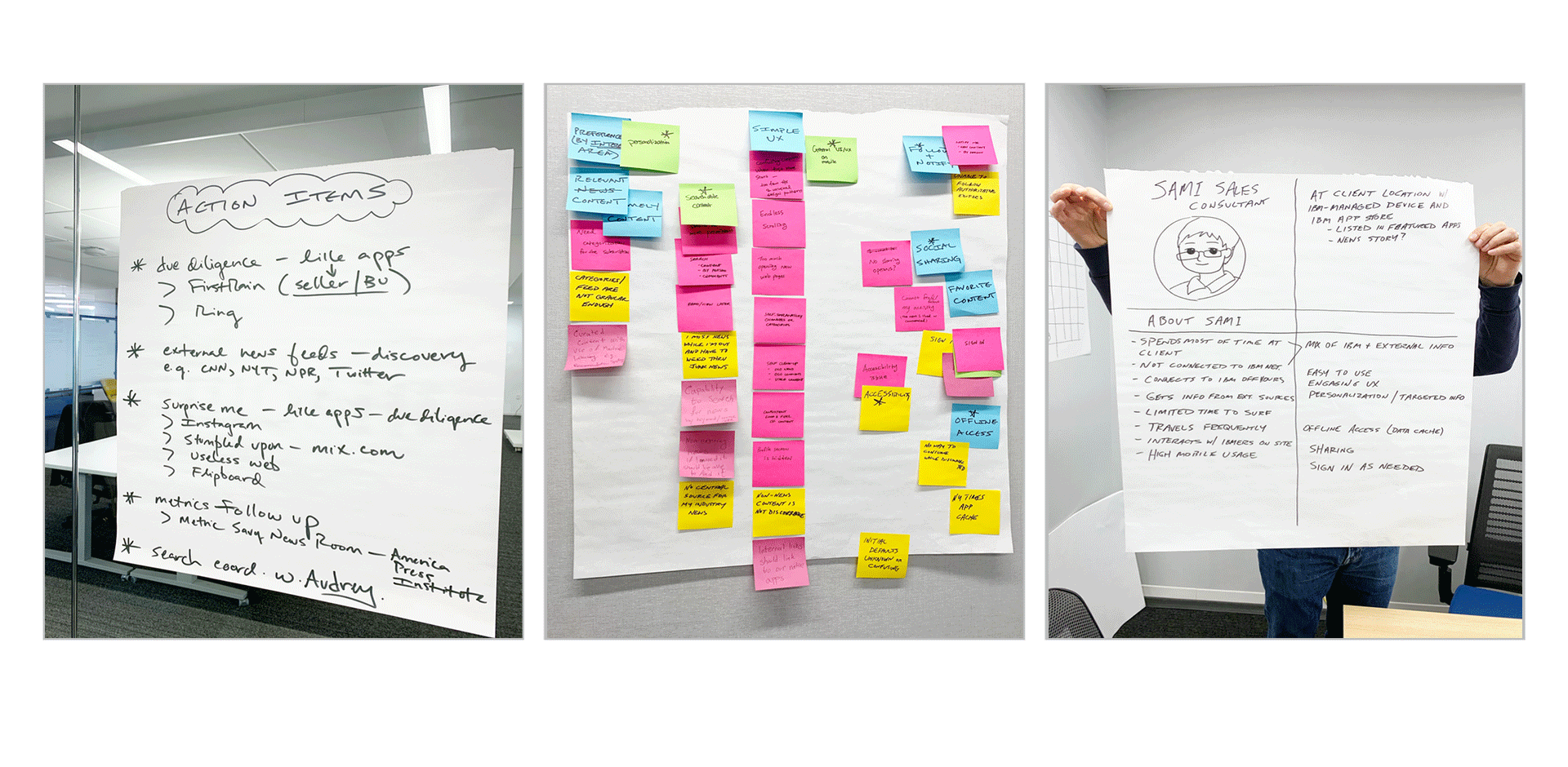
Competitive Analysis
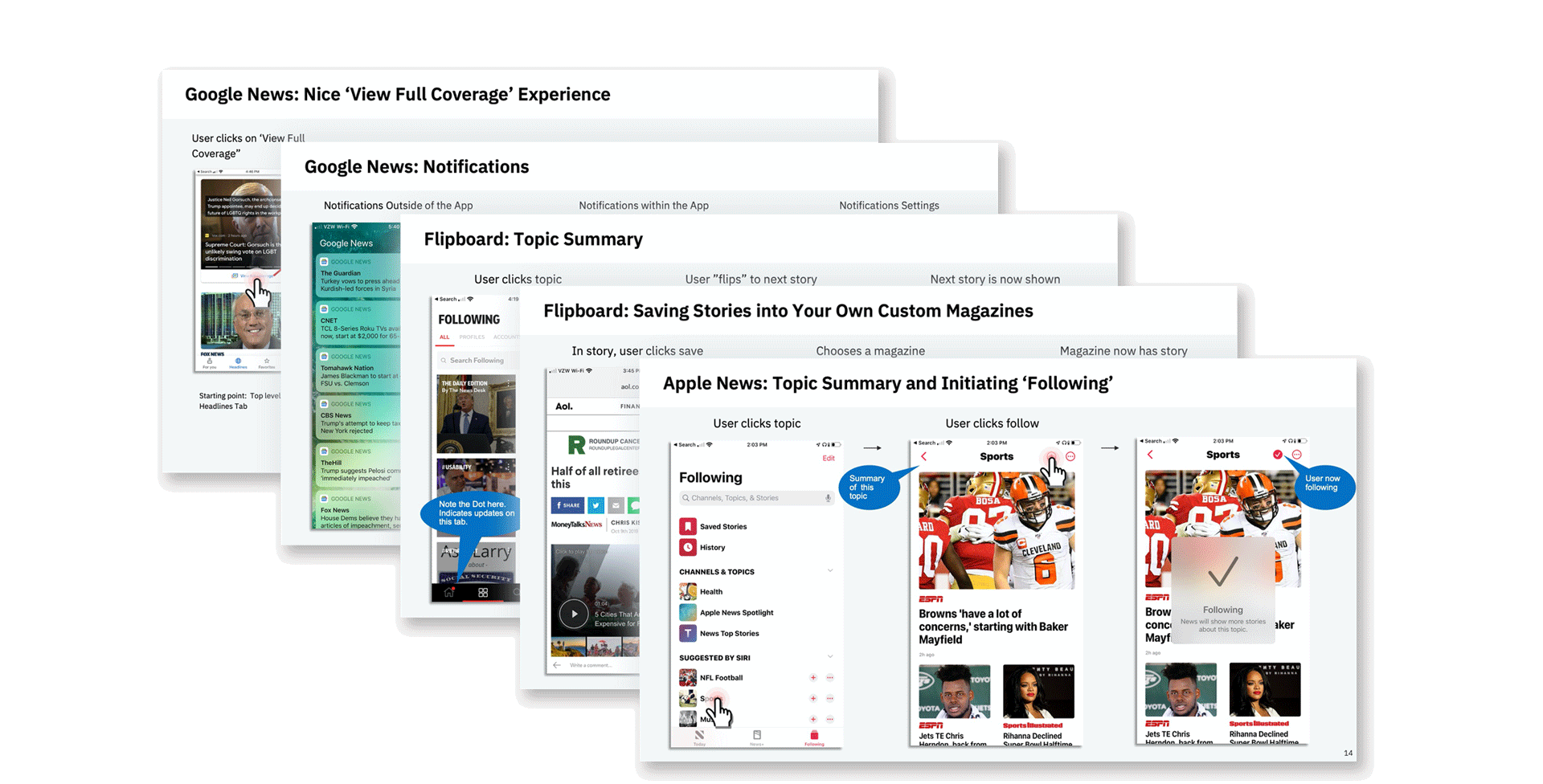
Define
Personas and Research
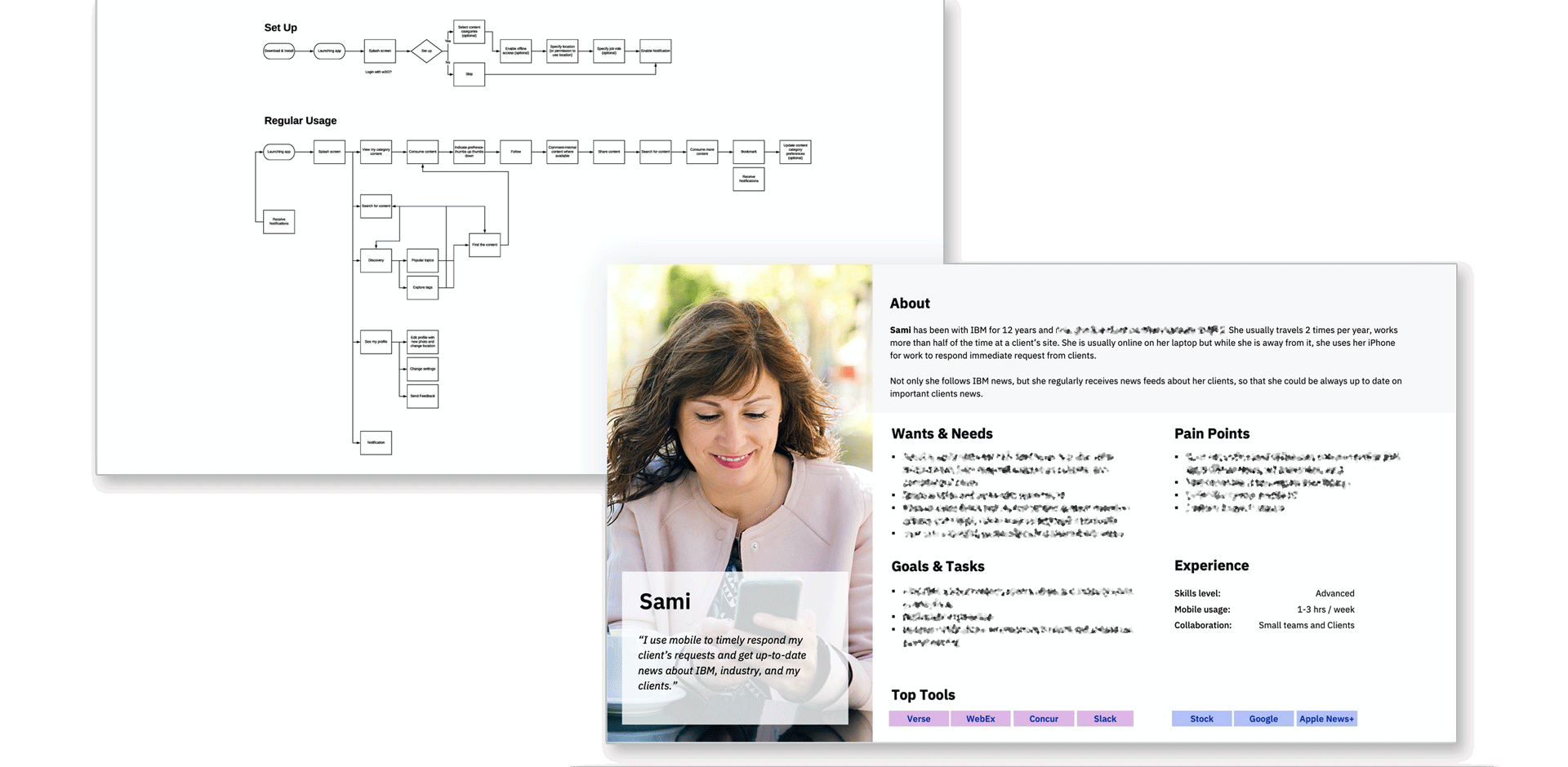
Ideate
Brainstorming: Big Ideas, Prioritization Grid
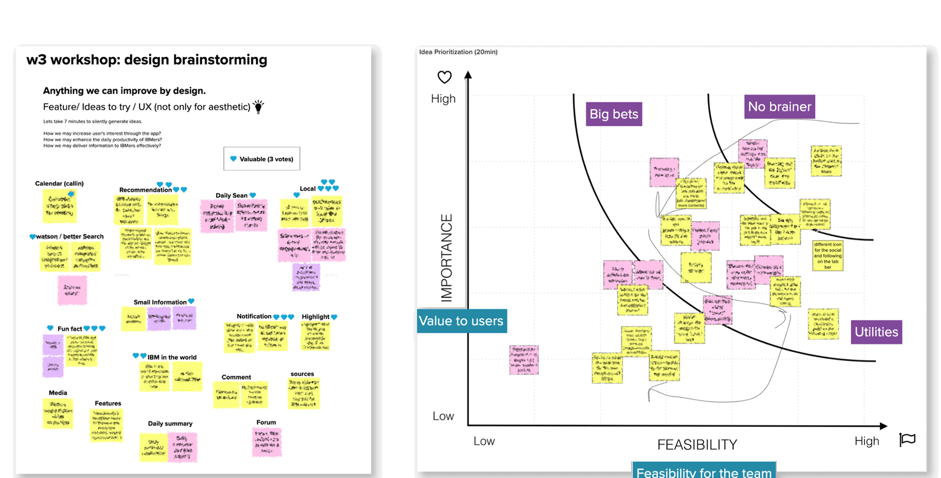
Prototype & User Reviews
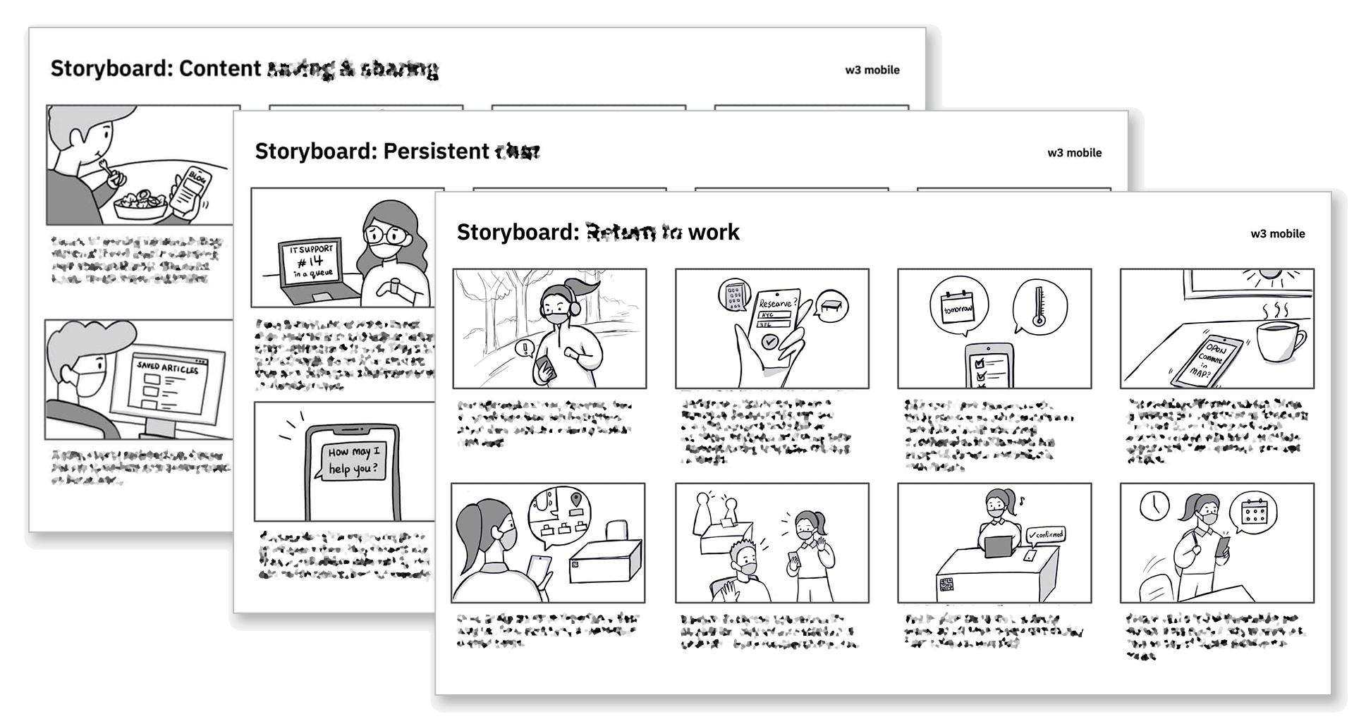
Storyboards
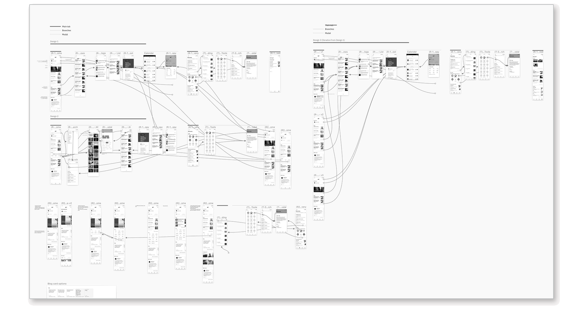
Low Resolution Mockups & User Flow
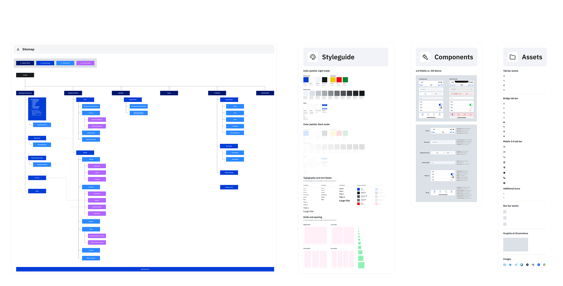
Site Map, Style Guide, Figma Components
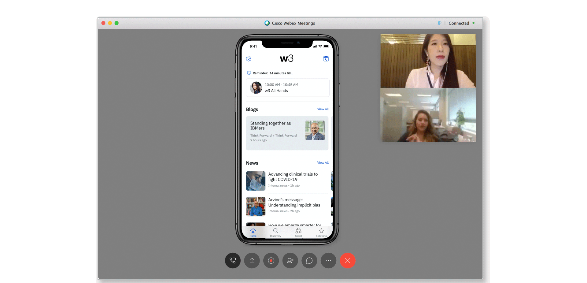
User Testing
Test
Iterate
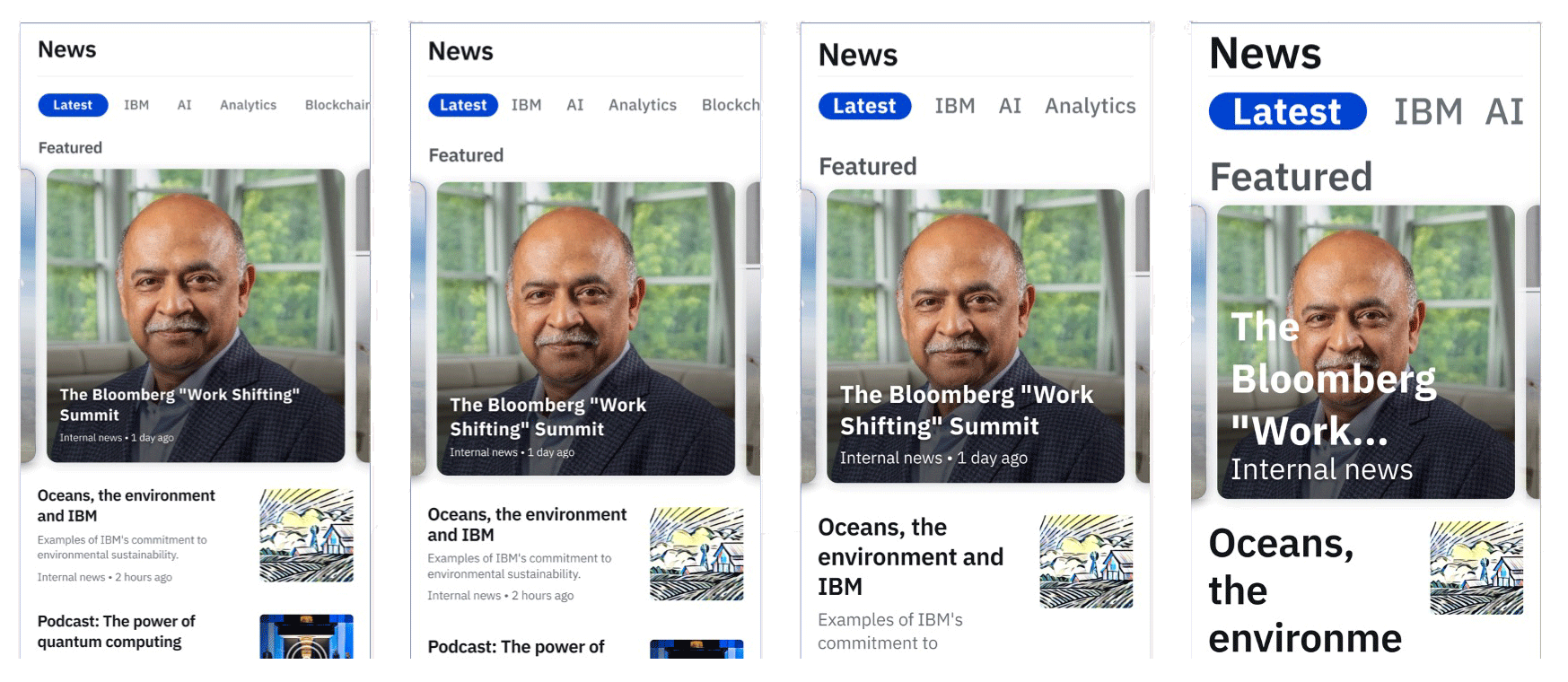
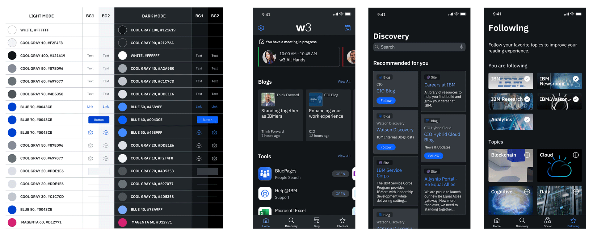
Based on usability testing, Dark Mode was implemented due to high user demand for improved eye comfort. I developed a new internal color palette, ensuring readability through rigorous contrast ratio testing. This dark mode design received positive feedback from various w3 project teams, leading to its distribution as a template for broader adoption. Additionally, Dynamic Type Sizes were crucial, allowing users to customize text readability. I applied Apple's latest Human Interface Guidelines for both standard and larger accessibility type sizes, a significant effort undertaken before Carbon for iOS became available.
Dynamic System Font Sizing
Dark Mode
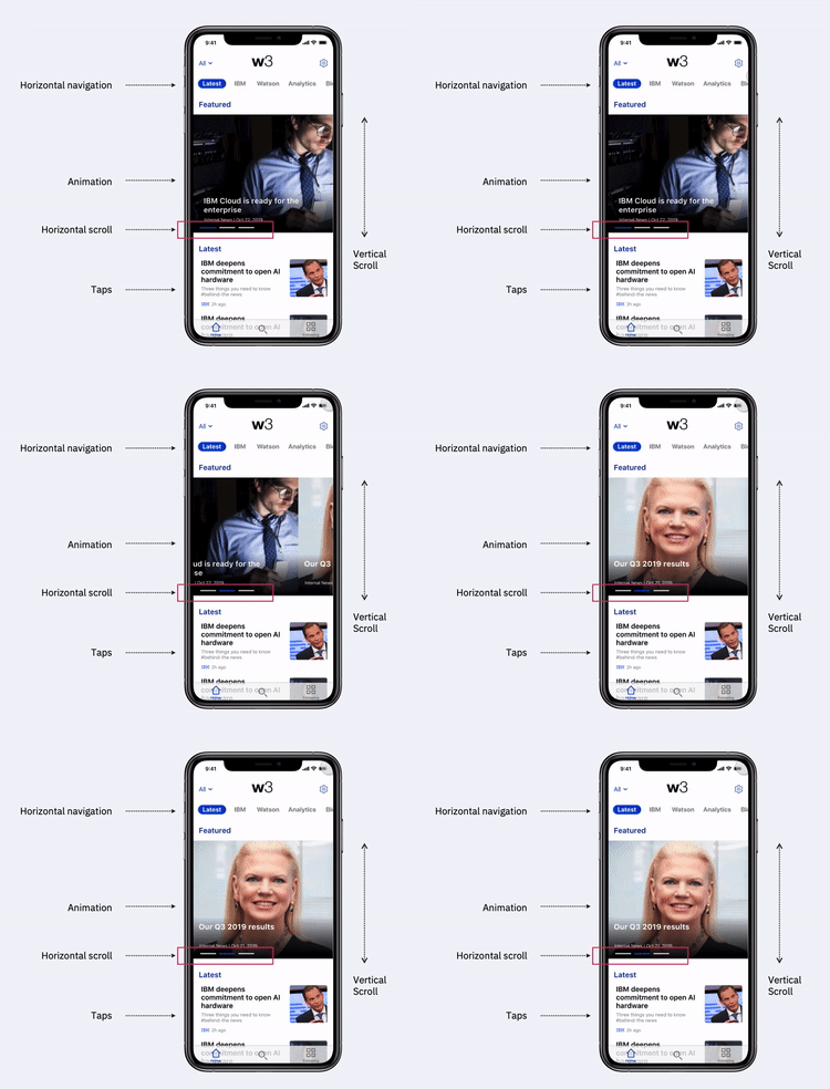
Design decisions were validated and refined through user feedback, including think-aloud protocols and observation of direct touch interactions, unique to mobile devices.
Project Key Results
Achieved widespread employee adoption, establishing the app as a primary internal communication and content discovery tool.
Implemented personalized content recommendations based on employee engagement.
Upper management decisions accelerated by 20% due to consolidated information.
16
NPS
Net Promotor Score
77%
“Very Satisfied”
User Satisfaction
60%
Faster
A survey of approximately 1,000 active IBMer MVP users yielded substantial positive feedback.
Sales Information Conveyed