
Case Study
Corporate Sales Quoting
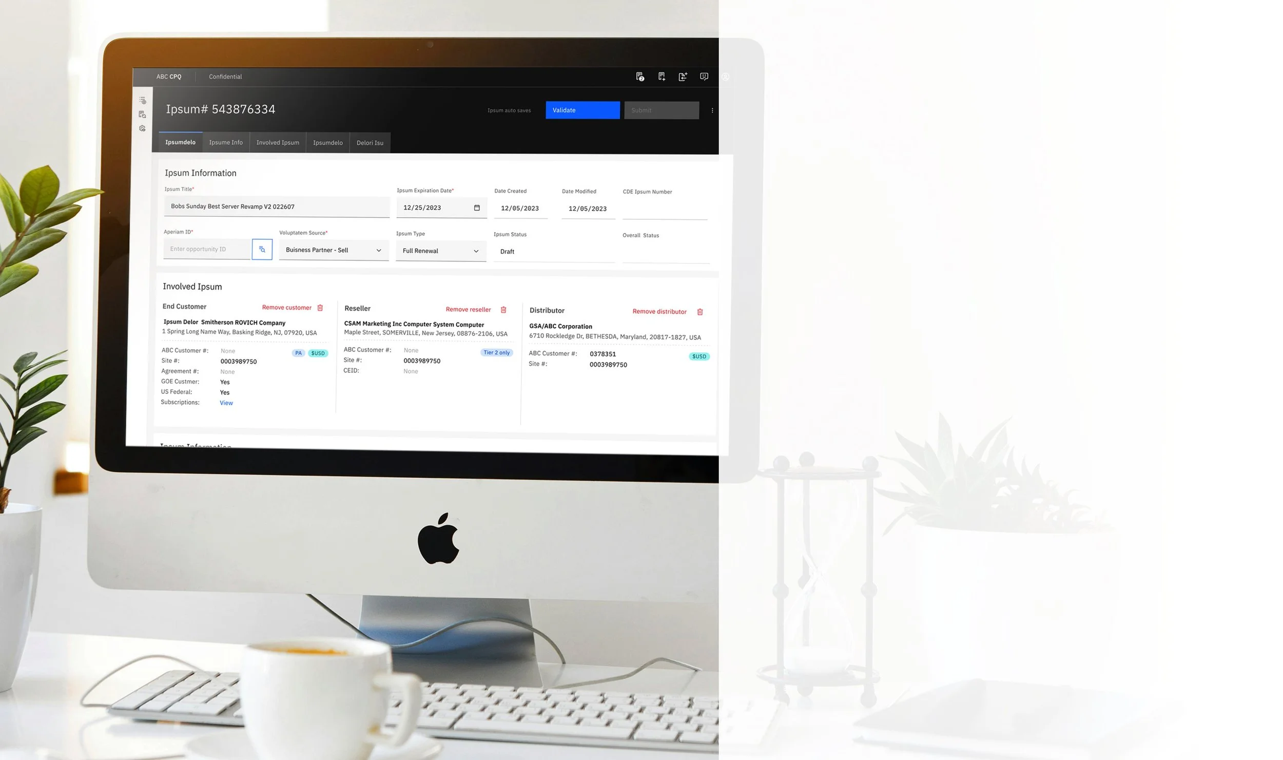
ABC Quoting was a sales enablement tool utilized by Sales to obtain quotes for diverse configurations of ABC software. Constructed on Salesforce, it employed a diverse range of data types (such as sales incentives, contract durations, component combinations, and customer demographics) to deliver the most competitive pricing offer to customers, thereby eliminating the need for additional approvals.
NDA in place
-
Objective
Lead the user experience and visual design efforts to transition from a legacy quoting system to an advanced
sales management platform, applying Enterprise Design Thinking and Agile methodologies to streamline
operations and enhance sales efficiency.
Key Results
Successfully transition from over 100 legacy applications to just four, simplifying the sales management process.
Decrease creation time for sales materials from 2 hours to 1 hour.
Reduce approval time for sales documents from 21 hours to 8 hours.
Conduct user research to identify pain points and inform design solutions, leading to improvements in user experience.
Apply design system standards, accessibility guidelines, and content consistency across the platform.
Replace the homegrown system with a best-in-class solution that enhances functionality and scalability.
Implement tracking mechanisms to gather metrics and user feedback, ensuring continuous improvement of the platform.
-
The development team for ABC Quoting commenced without designers, attempting to transfer all functionality from the previous tool while adhering to the design system of choice (Carbon Design System). The development team lacked specifications, and changes were being driven by an external contractor who was familiar with Salesforce but lacked direct contact with the users of the tool.
-
ABC Quoting is a revised version of a 20-year-old locally developed solution that had become increasingly challenging to maintain. The ABC client sought to replace this homegrown tool with an industry-standard platform.
-
My Role:
Lead UX/Visual DesignerMy Team:
UX Designer
Jr. UX Designer
Jr. Visual Designer
Senior User Researcher
Business Analyst/User Research
Jr. User Researcher
-
Sales
Sales Management
Executive
User Age: 22-60
-
Figma
Photoshop/Illustrator
Jira

While the specifics of this project are protected by a non-disclosure agreement, I will concentrate on the two most significant challenges encountered and end with examples of the finished design.
Challenge 1
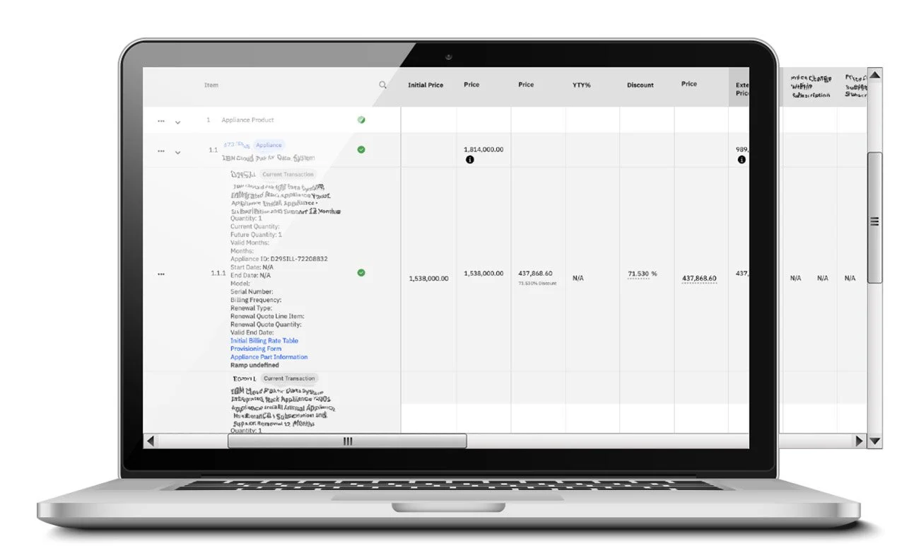
Primary products table
The "Products" table served as a comprehensive inventory management interface, akin to a shopping cart but encompassing hundreds of individual software offerings. It detailed each product, associated adjustments, and provided a mechanism for real-time modification of inventory levels.

So It begins…

Empathize
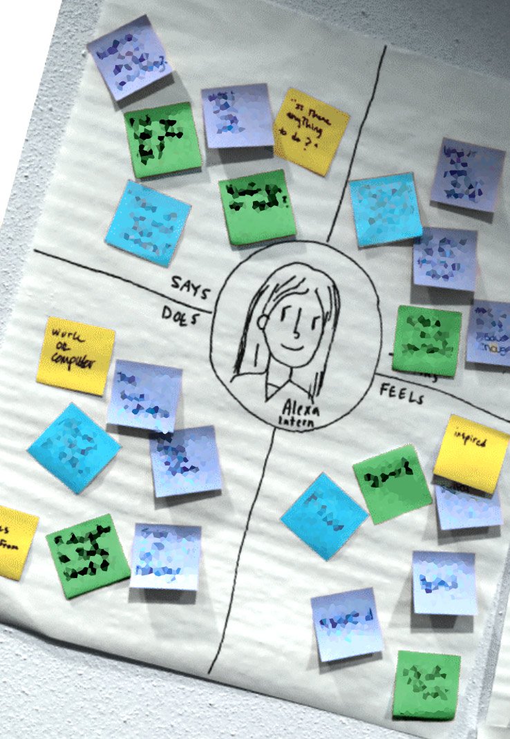
As part of our research into the product table experience, we conducted empathy mapping, user interviews and usability A/B testing to better understand how people interacted with the interface.
Through this process, several consistent pain points emerged:
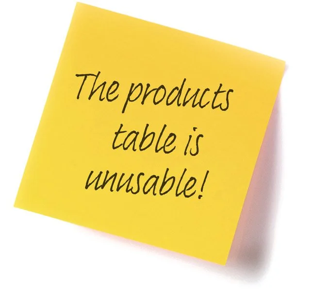
Readability issues: Users struggled to understand the contents of the quote they were creating, finding the table difficult to interpret at a glance.
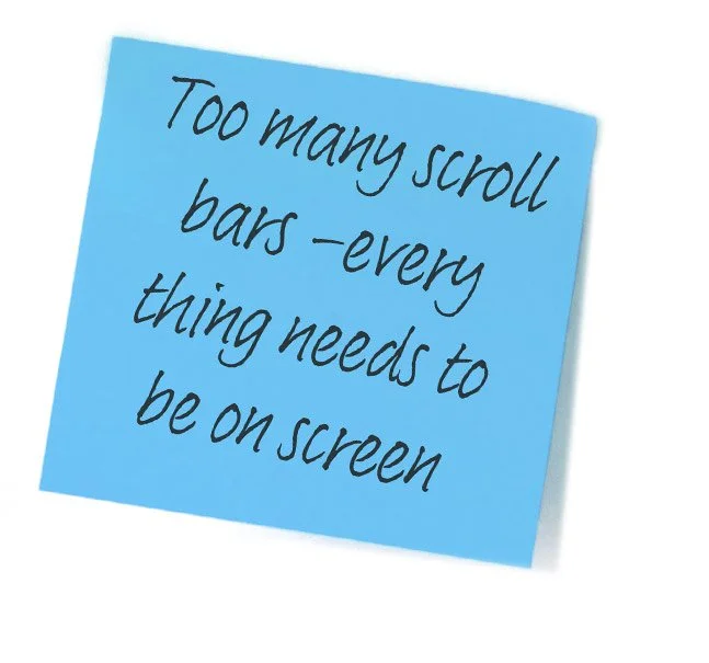
Limited visibility: The table displayed too little information at once, forcing users to scroll extensively within an internal scroll bar to view cart contents.
Lack of clarity around editing: It was not intuitive how to modify or update items in the table.
Difficulty locating items: Users found it challenging to search for or locate specific items within the table.
Define
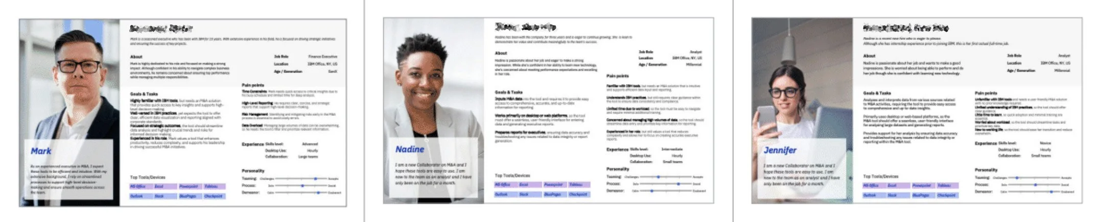
Following our research phase, and informed by insights from our key user personas, we identified three critical areas demanding focused attention:
Optimizing Data Presentation within Fixed Constraints: Given the platform limitations preventing user-driven column resizing, reordering, and hiding, we need to strategically maximize the available screen real estate for critical data elements within tabular views.
Enhancing the Editing User Experience: To improve user efficiency and reduce ambiguity, we must clarify the pathways to editing functionalities, ensuring they are readily discoverable and intuitive.
Developing a Robust Search Capability: To facilitate efficient information retrieval, we need to implement a search experience that enables users to quickly and accurately locate specific data points.
These areas represent opportunities to significantly improve the user experience and overall utility of the platform.
Ideate
Following the problem definition, the subsequent phase involved exploring potential design solutions to address the identified challenges, primarily the extensive data volume and its diverse presentation formats. Given that the majority of our data was stored in Figma, which adhered to a design system, I was able to bypass the sketch phase and proceed directly to high-fidelity mockups.
Several concepts were investigated:
Implementing Expandable and Collapsible Sections: This approach aimed to enhance data navigation by allowing users to selectively focus on specific segments of the table, thereby mitigating information overload.
Investigating Column Consolidation Strategies: To reduce the need for horizontal scrolling and improve data comprehension, the feasibility of combining semantically related columns was explored.
Developing Clear Editability Indicators: Various visual and interactive methods for clearly communicating editable data fields were prototyped and evaluated.
Integrating Direct Search Navigation: A straightforward search functionality was considered to enable users to quickly locate specific information within the table and navigate directly to its location.
To gather crucial user insights and validate these potential solutions, we conducted user feedback sessions. These sessions focused on understanding data relevance, identifying potentially redundant information, and establishing a clear hierarchy of data importance from the users' perspective.
Prototype & test
The final stage involved prototyping the proposed design to facilitate user validation and ensure technical feasibility for development. Given the integration with an existing system, it was crucial to confirm the implementability of the design solutions. Through close collaboration with the lead UI developer, I iteratively refined the prototypes based on technical constraints, ensuring that the user-validated design models were indeed achievable within the existing infrastructure. This collaborative approach mitigated potential development roadblocks and ensured a smoother transition to the implementation phase.
Iterate or release
The journey from Ideate to a validated solution is rarely linear in Design Thinking; it's more of an iterative loop involving Ideate, Prototype, and Test. After brainstorming various ideas in the Ideate phase, we don't jump straight to a final product. Instead, we quickly build low-fidelity Prototypes – these could be sketches, wireframes, or simple interactive mockups. The crucial next step is to Test these prototypes with users. This early testing provides invaluable feedback on the viability and usability of our ideas.
Based on user feedback during testing, we often revisit the Ideate phase. We might discover that our initial assumptions were incorrect, or that users have needs we hadn't considered. This leads to generating new ideas or refining existing ones. We then create updated Prototypes, incorporating the feedback, and return to Test again. This iterative cycle of Ideate, Prototype, and Test allows us to progressively refine our solutions, ensuring they are user-centered and effectively address the identified problems before significant development investment. Each iteration brings us closer to a solution that truly resonates with our users.
Then and Now
First, I present the initial state of the table, which was rendered unusable by our clients. To the right, you can observe the optimized table. The clients reported that the optimized table was easier to scan, offered much friendlier layout for smaller resolutions, and generally enhanced their user experience.
Then
Now
To provide a clearer understanding of the product table’s placement within the page and the project’s initial state, I have included the original layout, the page before my design intervention, and the page after my intervention.
Initial
Then
Now
Challenge 2
Add a new customer
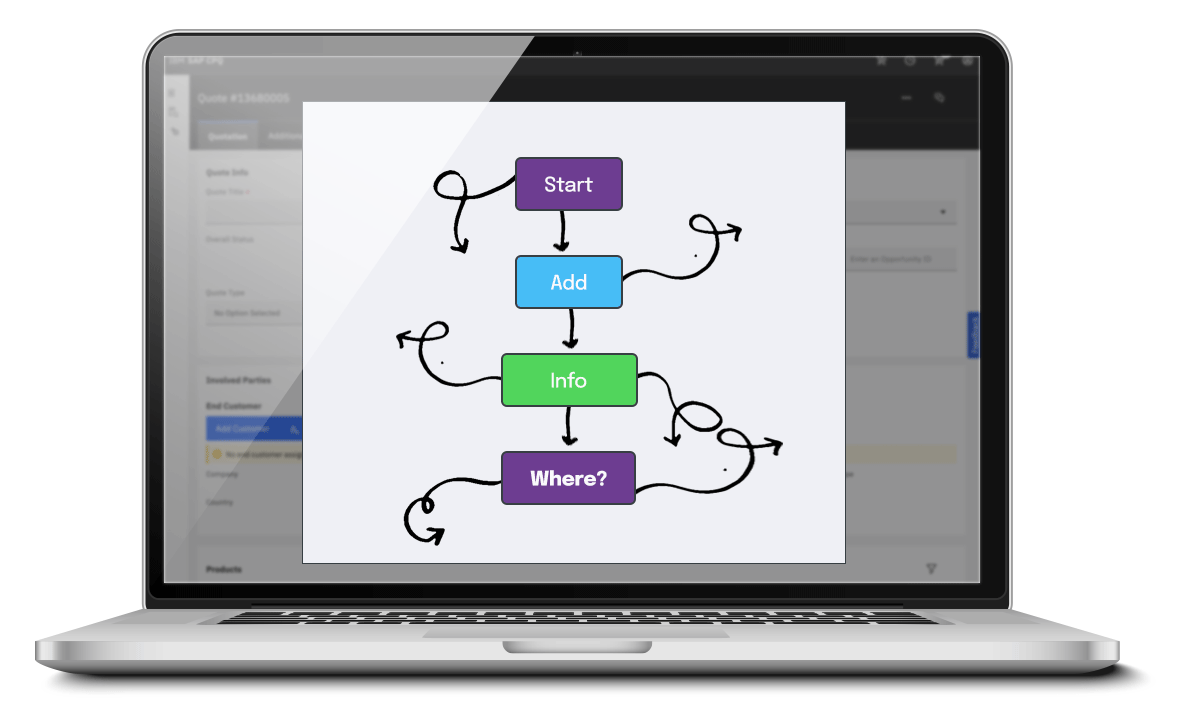
Being able to “Add a customer” to the clients database would be critical to most clients. If that relatively simple task becomes a nightmare, the rest of the applications experience will seem that much worse. That was my job. Take a confusing single-path experience to a smooth multiple-path experience with support for multiple statuses.
Empathize, define, idea… well, you get it.
The latter portion of this case study employed an identical methodology to the preceding section. To optimize readability and minimize scrolling, the consolidated process, along with supporting visuals, is provided below.
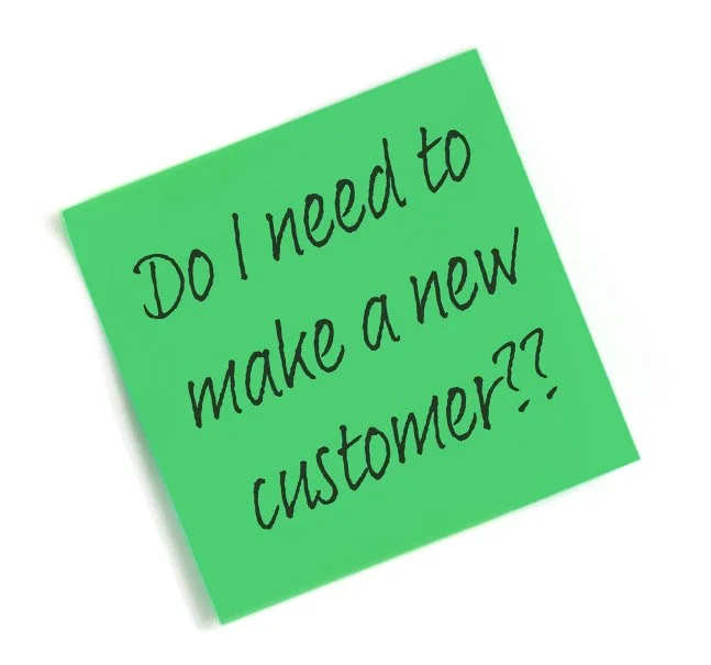
A consistent point of friction for users emerged during the process of adding new customers. The original configuration, which mirrored SAP's default linear structure, invariably led to confusion. Through comprehensive user reviews and surveys, we pinpointed the core pain points, enabling us to formulate precise problem statements. The central challenge lay in the users' difficulty distinguishing between several outwardly similar scenarios:
Existing Customer, Existing Location: The customer and their corresponding location already resided within the data source, yet users struggled to locate them.
Existing Customer, New Location: The customer existed in the data source, but required the definition of a new site or location.
New Customer: The customer was entirely new to the system.
New Customer with Business Partner: A new customer was being onboarded, and a business partner was slated to collaborate with them.
Discussions with users unequivocally indicated a need for more comprehensive guidance and a departure from the restrictive linear workflow throughout the customer addition process.
Figure 3 shows the original linear flow
Fig 3.Now it came down to ideating, prototyping and testing
Ideating around this issue involved multiple conversations with SMEs and developers, to determine what information we had about customers and their sites in our back-end data sources, what was possible, what our (Fig 4.) timeline allowed, and ,based on that, what information we were able to source.
Fig 4. Road Map (timing) For instance, we aimed to facilitate the identification of whether a customer and its associated website already existed. Various pieces of information could assist a seller in determining this, such as the existing licenses for a specific customer website and the historical sales records to that website.
Sellers also required knowledge of business partner involvement with customers. Therefore, a component of the solution involved retrieving data from other data sources. Once all information was gathered, a novel user flow was devised (Fig 5).
Fig 5. User FlowOnce the flow was approved, I transformed it into an interactive Figma demonstration (Fig 6) and subsequently returned to our users for verification of all modifications. Subsequently, the Figma designs were transferred to the Development department for implementation.
Regrettably, due to the fact that the flow and all content were safeguarded under the company’s non-disclosure agreement (NDA), the creation of a shareable prototype was strictly prohibited. If all the NDA data were removed or supplemented with Latin text, the prototype would lose its intended purpose.
Fig 6. Interactive Figma Prototype Project Key Results
Applied design system standards, accessibility guidelines, and content consistency across the platform.
Replace the homegrown system with a best-in-class solution that enhances functionality and scalability.
Implement tracking mechanisms to gather metrics and user feedback, ensuring continuous improvement of the platform.
2H→1H
Creation Time
Hours Saved
21H→8H
Approval Time
Hours Reduced
100→4
Apps transitioned
Sales Process Simplified